Saturday, December 16, 2006

Paper: Deckle Edges & Simulations


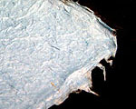
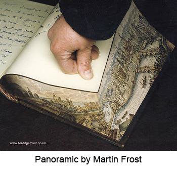
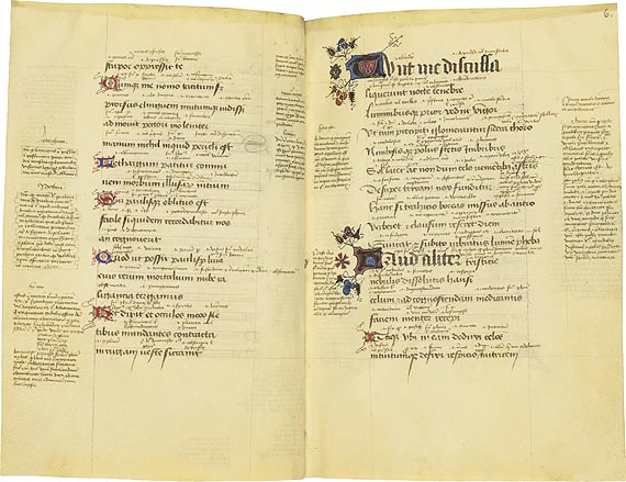
The term deckle edge refers to the distinctive, feathery edge of handmade paper. It occurs when the handmade paper is made. The name comes from the equipment used to make the paper, a mould and deckle. The mould is a wood frame covered with a special papermaking screen. The deckle is an open frame that is placed on top of the mould. The papermaker places the two pieces together and drags them through a vat of fibrous material floating in water, called the pulp, catching the fibers evenly on the screen. The deckle is removed and the sheet of paper is transferred from the mould to an absorbent surface called a felt for pressing the water out of the paper sheet.

Handmade paper normally has four deckle edges and the edges are often quite dramatic while machine-made paper has two and are more subtle. Although early printers looked upon the deckle edge as a defect, and almost invariably trimmed most of it off before binding, in the latter part of the 19th century, it became the fashion to admire the deckle edge for its own sake, and to leave books printed on handmade paper untrimmed. Left in place, the deckle edge becomes a decorative, textured edging.

Simulating a Deckle Edge. A true deckle edge can only be achieved during the paper making process. However, there are various ways to simulate the effect, some more effective than others.
Tearing. The easiest way is to paint a line of clean water with a watercolor brush either freehand or held against a ruler, wait a while, then pull gently. Add more water or pull less gently depending on the strength and the grain of the paper and the effect desired. If you score the line first using a bone folder, then paint with water, the result is a finer edge.

Rulers. Deckle patterned rulers are available against which the paper is torn. A wet tear will achieve a more feathery effect than a dry tear.

Scissors. Although the effect is decorative, deckle scissors, those with irregularly shaped cutting edges, create the least natural looking deckle edge.
Photos of deckle edges (top): left: handmade paper; right: machine-made paper.

Friday, December 15, 2006

Book Formats & Paper Sizes


The traditional terms for describing book formats are derived from early printing methodology and the size of early handmade sheets of paper.

Paper Sizes: the most common names for the original size of paper from which the formats described below were created are:
· Imperial (30 in. by 22 in.)
· Royal (25 in. by 20 in.)
· Demy (22 ½ in. by 17 ½ in.)
· Crown, cr (20 in. by 15 in.)
· Foolscap, fcp (17 in. by 13 ½ in.)
· Pott (15 in. by 12 ½ in.)
A sheet, when folded, has twice as many pages as leaves, for the obvious reason that it is printed on both sides, the number of leaves depending on the size of the original sheet and the way in which it is folded.

When two leaves (four pages when printed on both sides) were printed on a sheet so that it could be folded once, collated with other folded sheets and bound, the format of the volume was a "folio". When four leaves (eight pages) were printed on the same size sheet, which would later be folded twice, the format of the resultant volume was a "quarto" (four leaves). The term "octavo" relates to the sheet having eight leaves printed on it. The octavo is the most general size of a book, and the printed text is so arranged that, when the sheet is folded, the sixteen pages follow consecutively (see illustration). This folded printed sheet of leaves prior to binding is called a gathering. After binding it is referred to as a signature.

Today some booksellers are providing the height of a book in inches or centimeters rather than using these early terms which do not relate directly to the sheet size or process used for printing today. The following is a guide to convert book formats to approximate book sizes:
· Folio: more than 13 inches tall
· Quarto (4to): approx. 10 to 13 inches tall, average 12 inches
· Octavo (8vo): approx. 8 to 10 inches tall, average 9 inches
· Duodecimo (12mo): approx. 7 to 8 inches tall, average 7.5 inches
· Sextodecimo (16mo): approx. 6 to 7 inches tall, average 6.5 inches
There are smaller and larger books, i.e. many miniatures are 64mo. Most hard bound books today are either octavo or duodecimo in size.

For definitions of other commonly encountered book terms see Glossary of Terms.

Friday, December 01, 2006

Free Online Bookbinding Books

I haven’t had a chance to get deeply into these books, but a cursory look impressed me.

The Art of Bookbinding by Joseph W. Zaehnsdorf
Bookbinding and the Care of Books by Douglas Cockerell
Bookbinding for Beginners by Florence O. Bean
The Binding of Books by Herbert P. Horne
The Story of Books by Gertude Burford Rawlings
A Book for All Readers by Ainsworth Rand Spofford
The Story of Paper Making by J.W. Butler Paper Company
Bookbinding by Paul N. Hasluck

Thursday, October 26, 2006

Hornbooks and Battledores


Hornbooks and battledores were two early literacy teaching aids. A hornbook was a primer for children, use from the 15th to the 18th century, consisting of a sheet of paper (or parchment) mounted on a thin wooden paddle, usually with a handle that was perforated so that the hornbook could be hung at the child’s girdle, or belt. The sheet usually had the alphabet, some pairs of letters, and a religious verse, often the Lord's Prayer. Because paper was so expensive, parents and teachers wanted to protect it. So they covered the paper with a very thin piece of cow's horn which was so thin, you could see right through it. Thus, the name, hornbook came to be used to describe this type of “book.”

Not all hornbooks were the same. Many were made out of metal, sometimes even silver. Others had the alphabet carved into paddles made of ivory (photo above). One special kind of hornbook was made out of gingerbread. As children learned each letter of the alphabet, they were rewarded with letters to eat.

Once the price of paper became cheap, companies started to make battledores. Battledores was an early form of badminton played with a flat wooden paddle and a shuttlecock. The paddle was probably similar in shape/size to hornbooks, thus, the word probably seemed appropriate as the name for the new book form which derived from them. Popular in the 1800's, battledores were made of thin cardboard. Although some battledores were made in the shape of a hornbook, the card was usually cut into the shape of a rectangle and then folded in
thirds.

The content of a battledore was similar to that of a hornbook, including the alphabet in both capital and small letters and pairs of letters as a phonics lesson. But, unlike the hornbook, battledores frequently had a mixed-up alphabet with the letters out of order as a way to help children distinguish individual letters. They also had lists of short words and sometimes included a prayer, but normally they had a short story or fable instead. With a greater surface area, battledores could contain illustrations. These were generally pictures of everyday life that would have been familiar to children of the time.

Tuesday, October 17, 2006

Artist Book: Woof by Madalyn Eastus

In a previous post I wrote about paper cutting and suggested using it creatively in creating artist books. Madalyn Eastus’ book, Woof, is one that does. Don’t let the title fool you though. This book isn't about dogs. Instead, the title comes from the weaving term, woof which refers to the thread which is shuttled back and forth across the warp (the set of lengthwise threads attached to a loom before weaving begins) to create a woven fabric.

Its pages are composed of colored papers that are die-cut and assembled by hand. Each page is a layering of several different pieces of cut paper that are tucked into slits (much like tucking a snapshot into those corners old photo albums used). The patterns evoke a range of traditional textiles from around the world, such as Amish quilts, Navajo blankets, Fair Isle knitted sweaters, and Indian ikats.


One of the things I particularly like about this book is how each pattern is changed by the pages before and after that peek through openings in the patterns.

Saturday, October 14, 2006

The 1000 Journals Project Film


One thousand blank journals are traveling from hand to hand throughout the world. People who find a journal read it, add to it, then pass it on...

Starting in December 2003, the production crew for the 1000 Journals Project documentary film contacted nearly 500 past, present and wait-listed journal contributors from around the world for pre-interviews via email, telephone, and in person, eventually selecting about 120 participants for filmed interviews. The filming took the crew to Europe (France, Germany, Spain, Italy, Croatia, Finland and the United Kingdom), Australia, Singapore, China, Canada and the United States. At the conclusion of postproduction editing, expected by December 2006, the film will be submitted to film festivals around the world for viewing on a big screen in 2007. View the teaser clip.

Tuesday, October 10, 2006

Peter Callesen: Paper Cut Sculpture


Recently, a friend emailed me about this artist and he is so phenomenal that I want to share him. Peter Callesen is a sculptor who works in paper, transforming a flat sheet (mostly single sheets of 80g. A4 paper, the kind sitting next to your computer printer) into a 3D form, leaving behind the negative space from which the form is created. Some of the the paper cuts relate to fairy tales, while others, Callesen states, “are small dramas in which small figures are lost within and threaten by the huge powerful nature … the thin white paper gives the paper sculptures a fragility which underlines the tragic and romantic theme of the works.

While his work is not specifically book-related, what strikes me when I look at it, is the connection I feel it has to popup books, origami, and silhouette paper cutting, many traditions rolled into one, any of which could be used by creative book artists in their work.

Big Paper Castle, 2004, 7,20 x 7,15 x 3,75 m
Cut and folded from one sheet of 350 gsm paper

Peter Callesen (b. 1968) lives and works in Copenhagen.

Saturday, October 07, 2006

Flexagons: Intro & Tetraflexagons, Part 1


My goal for this blog is to post at least one or two topics a week but sometimes life gets in the way. I spent a few weeks in August and September researching flexagons in order to put together the first of a two-part demonstration and workshop for my local bookarts study group. While flexagons are fun to play with as toys, they offer an unusual structure that can be used for text or images that mysteriously appear and disappear as their “pages” are turned.

To begin, flexagons are flat models made from folded strips of paper that can be flexed to reveal a number of hidden faces. There are two types of flexagons, flat and 3-dimensional. In this post I will be talking about the flat type.

In the flat group there are two types: four-sided (tetraflexagons) which are rectangular, usually square, in shape, and six-sided (hexaflexagons) which look like hexagons (these will be covered in another post). Depending on the template used and the folding pattern, flexagons can have three, four, five, six or more faces. Appropriate prefixes are added in front of the basic name to indicated how many faces. So, tetraflexagons become tri-tetraflexagons (3 faces), tetra-tetraflexagons (4 faces), penta-tetraflexagons (5 faces) and hexa-tetraflexagons (6 faces). Likewise, hexaflexagons become tri-hexaflexagons (3 faces), tetra-hexaflexagons (4-sided), etcetera.

As if the names weren’t confusing enough, a tetra-tetra-flexagon has several entirely different templates and folding patterns, so the name itself doesn’t tell us much about what type of flexagon it is, only that it has four sides and four faces. The most popular is based on the principle behind the 2000-year old Chinese toy called a Jacob’s Ladder and is sometimes called a magic book. Each face can have a different image or text that is revealed as one flexes the structure. Here is an article on how to make one.

This is a big topic, one which cannot be adequately covered in a few postings. If you get hooked, don’t be surprised if you find yourself spending hours of enjoyment (and sometimes frustration) as you try out the various structures and plot how to design on them.

Book credits (variations on Jacob's Ladder/Magic Book structure):
1st book, Jane Cheng, Baucis and Philemon (Ovid Met. 8.611-724) trans by artist
2nd book, c. j. grossman, Magic Book with Secret Panels

Monday, September 11, 2006

Invisible Artwork: Fore-Edge Painting


Fore-edge paintings are watercolor decorations, painted on the ends of the pages of the fore-edge of a book. In most cases, a fore-edge painting is only visible when the pages are fanned out.

According to Wikipedia, the earliest fore-edge paintings date possibly as far back as the 10th century and were symbolic designs. The first known example of a disappearing fore-edge painting (where the painting is not visible when the book is closed) dates from 1649. Around 1750 the subject matter of fore-edge paintings changed from simply decorative or heraldic designs to landscapes, portraits, and religious scenes, first in monochrome and then later in full color. In many cases, the chosen depiction related to the subject of the book, but in other cases it did not.

The technique involved fanning the fore-edge of the text block (the outer edge) and clamping it. Then, a watercolor painting would be executed on the fanned leaves. When dry, the fore-edge would most commonly be gilt, less commonly marbled. thus concealing the existence of the painting until the fore-edge was fanned.

In addition to the standard painting, sometimes known as a single, there are several variations:
  • split … each half of the fore-edge bears a different painting.
  • double … shows an illustration when the fore-edge is fanned out the usual way, and a completely different painting when the pages are fanned out in the opposite direction.
  • triple ... in addition to paintings on the edges, a third painting is applied directly to the edges (in lieu of gilt or marbling).
  • panoramic … the illustration covers not only the fore-edge but the top and bottom edges of the book as well.
One practitioner, Martin Frost, whose work is pictured here, has produced well over 3000 fore-edge and miniature paintings since 1970. His site has a video of the fanning process. This site has some examples done by students in one of his workshops.

Saturday, September 09, 2006

Parts of the Book

Whether binding traditionally or making artist books, the parts of the book are something we all should know. This site has nice drawings. Here is another site which has photographs.


Thursday, September 07, 2006

Exhibit: The Evolution of the Medieval Book


tudy of the manuscript book as a physical object is known as codicology – from codex, a Latin word for "book," especially one whose pages can be turned, as distinguished from a scroll. Codicology is concerned with writing surfaces (parchment and paper) as well as the covers, stitching, etc. that make up a binding.

The Evolution of the Medieval Book traces the history of the medieval book–its appearance, content, audiences, and forms–from the 9th to the 15th centuries.

Looking at these old books with their beautiful illustrations (illuminations) and text makes me want to take up calligraphy. It is interesting to note that marking up text and making notes on the page is not a modern development.

Sunday, September 03, 2006

Tools: Bone Folders

Although materials like horn, stone and teflon are being used to make them, the classic bone folder is a shaped piece of bone carved from real animal bones, often deer or elk. Bone is an ideal material to use for smoothing, scoring, and creasing paper and cloth because it is sturdy, smooth and grainless. It can also be used for burnishing (polishing and imparting glossiness) and with sufficient (or excessive) pressure its edge is sharp enough to cut paper or cloth.

Many bone folders are carved with ornate handles or other decorative features, but a basic bone folder is typically shaped like a wooden tongue depressor or a large popsicle stick with rounded ends or a pointed end for working in corners.

Basic bone folders can usually be found in hobby and craft stores and online bookbinding supply merchants. More ornate bone folders are harder to find but there is nothing to prevent the owner of a plain bone folder from personalizing it with a little carving of their own.

Links to photos:
Top Photo
Bottom Photo

Monday, August 28, 2006

Featured Artist: Daniel Essig

Thinking about the Pulp Function competition I wrote about yesterday, I realized that books were not mentioned in the blurb about the exhibition but I hope book artists will consider entering. I think a survey of contemporary paper art should include books and there are a lot of book artists who use paper in innovative ways. Daniel Essig is one of them.

Daniel is a full-time studio artist in Asheville, North Carolina. His interest in book arts grew from his introduction to handmade books while he was studying photography at the University of Illinois at Carbondale. One of the first books he made, before he knew how to bind, was an altered book in which he placed his photographs so that viewers had to explore them actively, rather than just wandering past images mounted on a wall.

Around this time, Daniel visited his sister in Iowa City and met her friend, Al Buck, who was making wooden-covered Coptic books, a binding used around the fourth century, in Ethiopia, North Africa. Al followed up and sent Daniel a book he had made with instructions. It took awhile, nearly two years, but Daniel eventually made a book with which he was satisfied.

After completing his degree at Carbondale, Daniel’s mentor Frances Lloyd Swedlund encouraged him to attend the Penland School of Crafts, where he concentrated exclusively on the Ethiopian coptic book structure. Another mentor, Dolph Smith, helped push Daniel beyond the simple Ethiopian book, to developing his bridge books using the same coptic binding, but with exaggerated elements.

It is interesting to note that Daniel still relies on the idea of the altered book. Some of the bridge books (one pictured here) contain well over 1000 pages. Not being able to afford too much new paper, Daniel searches for books with mangled spines and covers but good quality paper to use in his work. He says he does not have a problem with the practice of tearing up old books, because the books he alters are not rare, and they've already lived their lives.

Sunday, August 27, 2006

Competition: Pulp Function Call for Entries

Exhibition Dates: May 19, 2007 - January 6, 2008
Travel: through 2010

Submission Deadline
: October 1, 2006

About the Exhibition: Paper, that humble material that we use daily and take for granted, emerged in the 1970's as a new material for the substance of art, not just the surface on which to draw or paint. Since then, not only has handmade paper pulp been cast into sculptural reliefs, it has been made into sensuous bowls. Paper cording and rolled newspapers have emerged as popular materials for making baskets and weaving wall hangings. The structural possibilities of recycled paper and cardboard have been explored in furniture and environmental sculptures. Origami paper folding from Japan, and even the timeworn traditions of Jewish, Chinese and Mexican papercuts have found new expression, along with politically charged silhouette murals cut from paper. This survey of contemporary paper art celebrates the updated traditions of paper in art, and a variety of new applications.

Art made from paper pulp, recycled paper, cardboard, papier mache and cut, folded or otherwise manipulated paper will be considered.

Fuller Museum of Art for more information. Click on Exhibitions, then on Pulp Function Call for Entries.

cartoon via The Book Arts Web

Tuesday, August 22, 2006

The 1000 Journals Project


Images from journals circulating in Ohio

If you ask a kindergarten class how many of them are artists, they'll all raise their hands. Ask the same question of high school grads, and few will admit to it. What happens to us growing up? We begin to fear criticism, and tend to keep our creativity to ourselves.

The 1000 Journals Project, is attempting to remedy our fear of exposing ourselves creatively by sending out 1000 journals throughout the world. The project began in 2000 when San Francisco graphic designer, Brian Singer, fascinated with the cryptic messages and drawings of bathroom graffiti, wondered what would happen if complete strangers around the world, not just those who happened to share a public bathroom, were able to exchange their private thoughts. As the project has evolved, Brian says, “what happens to the journals is as significant as what happens in them. Are people selfless enough to send them back, or will they find them and keep them?” To date, only one journal has been returned but many pages from the ones still circulating have been uploaded to the site.

Monday, August 21, 2006

1001 Journals

Journals serve a number of purposes. They provide a place to collect ideas, to store clippings of articles, photos … anything that inspires. Journals can be reference books when what is stored are notes about techniques, recipes, swatches, samples or photographs. They can be a repository of events in the life of the journalist or observations, written, drawn or photographed, of the world. If a journal is kept regularly, patterns emerge, patterns that reveal what is attractive/interesting to the journalist and patterns in the journalist him/herself.

Even though there is a trend in making journals works of art, journals do not have to be planned to end up being works of art. Setting such a goal, especially for a beginner, can be intimidating. Better to aim at exploring the process of keeping a journal, and practicing letting go of judgment and inhibitions. For inspiration, take a look at the examples at 1001 Journals, a recently developed website that appears to be growing fast. There you will find a variety of personal and collaborative journals.

Some ideas: writing (pen, pencil, typewriter, computer), calligraphy (brush, pen, ink), drawing (pastels, crayons, pencil, gel pens), painting (watercolor, acrylic, felt pens), photography (black & white, color, polaroid transfers), printing (stamps, patterns, shapes, symbols), collage (pasting, textures, photocopies), resists (oil, wax crayons).

Sunday, August 20, 2006

Turning the Pages


Leaf through 15 great books online and magnify the details. Yes, that's correct. You can actually turn the pages of these books ... well, virtually, that is. Turning the Pages is the award-winning interactive program that allows museums and libraries to give members of the public access to precious books while keeping the originals safely under glass.

A high-speed internet connection will give you the most features but for viewers with a dial-up connection, there is a narrowband version and versions that don’t require turning, that display images of pages (and enlargements) in standard web pages. To enhance the viewing experience, there are text and audio buttons, in addition to the magnifier. Extra buttons appear if there are additional things to see or hear. Some features are specific to individual manuscripts. In Leonardo's Notebook, for example, a button turns the text round (when using the magnifier) so visitors can read his famous 'mirror' handwriting. There are complete readings of Alice's Adventures under Ground and Jane Austen's The History of England, and audio descriptions of each page of the other books.

The trick to turning pages successfully is to move your cursor off the book once the page starts lifting but continue moving your cursor in the direction you want the page to go. Once the page starts falling onto the other side you can stop.

SKETCHES BY LEONARDO: The genius's personal notebook
MOZART'S MUSICAL DIARY: With 75 audio excerpts
THE ORIGINAL ALICE: Written and illustrated by Lewis Carroll
MASTERPIECE OF THE RENAISSANCE: Beautiful images from the Sforza Hours
JANE AUSTEN'S EARLY WORK: The History of England in her own hand
FIRST ATLAS OF EUROPE: Compiled by Mercator in the 1570s
OUTSTANDING 15TH-CENTURY CHURCH BOOK: The wonderful, and weighty, Sherborne Missal
CLASSIC OF BOTANICAL ILLUSTRATION: Elizabeth Blackwell's remarkable Herbal
BAYBARS' MAGNIFICENT QUR'AN: Epitome of sumptuous Arabic calligraphy
PINNACLE OF ANGLO-SAXON ART: The priceless Lindisfarne Gospels
THE OLDEST PRINTED 'BOOK': The Diamond Sutra, printed in China in 868
GLIMPSES OF MEDIEVAL LIFE: Selections from the famous Luttrell Psalter
FLEMISH MASTERS IN MINIATURE: The superb so-called 'Golf Book'
GLORIOUS HEBREW PRAYER BOOK: The lavishly illustrated Golden Haggadah
A LANDMARK IN MEDICAL HISTORY: Vesalius's stunning 16th century anatomy

In addition to the turning pages books, the British Library contains many millions of books, manuscripts, maps, newspapers, magazines, patents, music scores, sound recordings, photographs and stamps. You can read a brief description of an item, view an enlarged image and either find out more or move on to another treasure.

Saturday, August 19, 2006

Typography: Letters in the Natural World


In the spring of 1960, Kjell Sandved arrived at the Smithsonian to conduct research. There, he met Barbara Bedette, the woman who was to become his collaborator, friend, and love of his life. And there, also, he discovered an old cigar box full of butterflies and moths. Among the specimens in the box was one with the letter “F” woven in a tapestry of color on it’s wing, reminding Kjell and Barbara of the embellished letters in old bibles and illuminated manuscripts. The discovery was to change their lives. They decided to travel the world and find all the letters of the alphabet from the wings of butterflies and moths. If there was one letter, there must be others.

The challenges were many, not least, Kjell knew nothing about photography and Barbara, nothing about butterflies or where the greatest diversity of design could be found. But, they persevered and in 1975, after years of traveling to botanical gardens, nature reserves and rainforests from the Amazon to New Guinea, and surviving malaria-infested jungles, leeches and ants while photographing letters and numbers on the wings of butterflies and moths (without killing any), their discovery was revealed in the first issue of the new Smithsonian magazine.

Visit the site and discover another nature alphabet and play around with both of them, even send an e-mail.

Sunday, August 13, 2006

Typography: Alphabet Crackers


bokstavskex n. biscuits, shaped like letters of the alphabet, manufactured by Göteborgskex and sold throughout the Nordic countries, hence the inclusion of the Nordic letters å, ä, ö, ø, and œ.

Convert words into biscuits. The bokstavskex automatic biscuit image generator will take words of your choosing and set them in type composed of alphabet digestive biscuits. For some reason, though, the alphabet is missing the letters 'q', 'w' and 'z’ and it doesn’t look like the missing letters are going to show up anytime soon. The present alphabet appears to have been created sometime in the late 1990s and the missing biscuit letters are, well, still missing. But, if you are curious, you can listen to a phone call, in Swedish (transcript available), placed to the cracker manufacturer asking why they weren’t included.

Saturday, August 12, 2006

Typoglycemia

Typoglycemia is the lighthearted name given to a purported recent discovery about the cognitive processes behind reading written text. The name makes little sense as glycemia is the concentration of glucose in the blood. It is an urban legend/Internet meme that does have some element of truth behind it.

The legend is propagated by email and message boards and demonstrates that readers can understand the meaning of words in a sentence even when the letters of each word are scrambled. As long as all the necessary letters are present, and the first and last letters remain the same, readers turn out to have little trouble reading the text.

The phenomenon is illustrated by this widely-forwarded e-mail message:
I cdn'uolt blveiee taht I cluod aulaclty uesdnatnrd waht I was rdanieg: the phaonmneal pweor of the hmuan mnid. Aoccdrnig to a rsceearch taem at Cmabrigde Uinervtisy, it deosn't mttaer in waht oredr the ltteers in a wrod are, the olny iprmoatnt tihng is taht the frist and lsat ltteer be in the rghit pclae. The rset can be a taotl mses and you can sitll raed it wouthit a porbelm. Tihs is bcuseae the huamn mnid deos not raed ervey lteter by istlef, but the wrod as a wlohe. Such a cdonition is arppoiatrely cllaed Typoglycemia.

Amzanig huh? Yaeh and you awlyas thguoht slpeling was ipmorantt.
In actual fact, no such research was carried out at Cambridge University. It all started with a letter to the New Scientist magazine from Graham Rawlinson in which he discusses his Ph.D. thesis.

While typoglycemic writing may be easy to understand, creating it is slow going. Consequently, a typoglycemia translator has been created to hlep you wtrie yuor own tmylyieogpcc msegesas or gaert Aermcian nveol.

The major part of this posting was taken from the Wikipedia article “Typoglycemia” under the GNU Free Documentation License.

Thursday, August 10, 2006

Competition: Flag Book Bind-O-Rama


Karen Hanmer, Destination Moon, 2003

Initiated in 2004, the Bind-O-Rama challenge and online exhibition, sponsored by The Book Arts Web, has become an annual event. The 2006 Bind-O-Rama will celebrate the Flag Book structure.

Book artist and conservator Hedi Kyle created the first flag book, April Diary, in 1979. The foundation of the flag book structure is an accordion folded spine to which rows of flags are attached in opposing directions. When read page by page, images and text appear fragmented and disjointed, but when the spine is pulled fully open, the flags assemble into a panoramic spread.

Many flag book creators do not take full advantage of the flag book’s structure to experiment with layering of imagery or text. Too often, they opt for the simple approach of merely attaching bits of images or text to the accordion spine, missing the opportunity to exploit the flap book’s structure, shape and color potential and the book’s spine and cover surfaces for additional imagery or text.

For those not familiar with the flag book structure, there is a tutorial with step-by-step instructions in the Bonefolder, Vol 2, No. 1, Fall, 2005, an e-journal for book binders and book artists. The journal is in PDF format for downloading.

Two Entries (maximum)
No Entry Fee.
Entry Deadline: September 15, 2006

Saturday, August 05, 2006

Graph Paper on Demand

Do you need a special type of graph paper to help you layout the design of your new book or box project, or do you need guide paper to practice your calligraphy or Japanese or Chinese brushwork? Perhaps your child needs something special for a class project. Instead of spending your valuable time shopping for it, download what you need from incompetech.com. It's free.

With thirty-two graphs from which to chose, you are sure to find one that is useful and when you do, you can tweak it by adjusting the size, color and line weight of the grid as well as the size of the paper. Once you've got everything the way you want it, print your paper from your web browser or download it as a PDF to your computer to print later.

Friday, August 04, 2006

Inaugural Post: The Art of the Book

Who would believe that the timid web explorer I was five years ago would morph into the web adventurer I have become. I give a good deal of credit to the introductory (i.e. reduced price) high-speed internet connection offer I received from my local telephone company those many years ago. I can always go back to dial-up I told myself. Not.

So here I am with tons of websites I have discovered. Why not start a blog? Thus was born The Art of the Book, a blog devoted to the bookarts. Here, I plan to post information that I think bookbinders and book artists might find interesting ... helpful ... inspiring. Topics will include, but will not be limited to, online book exhibits, tutorials, materials and tool resources, typography, announcements of competitions, blogs ....

Feel free to comment. I can't guarantee that I will answer but I do promise to read every comment. If you are not comfortable with identifying yourself, I have enabled anonymous commenting, although I do hope commentors will created aliases so that I can associate postings with a particular person, even if they wish to remain anonymous.